In photography, color concepts can vary greatly. For example, when you take photos, do you ever think about whether you want to create a warm or cool image?
Take these two images below.
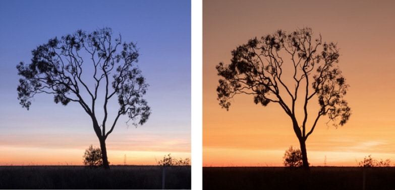
I shot these two images one after another, yielding different results depending on how I set my camera’s color temperature. Apart from cropping into a square and resizing for this article, no other edits have been done to them. They are how they came straight out of the camera.
Color Concepts. Kelvin Settings
To create an image with warmer tones (photo on the right), select the cloudy or shade white balance. Either setting will make your scene or portrait look warmer. Or better still, learn how to make better use of your camera’s Kelvin White Balance setting.
Greater than 5000K will yield a warmer orange light. Less than 5000K will create a more blue, cooler feel to an image.
I highly recommend sitting your camera on a tripod at sunrise or sunset and experiment with Kelvin White Balance at extreme ends of the scale. This is the best way to learn the art of color concepts yourself. It is amazing how creative you can get in camera when it comes to color tones.
If you don’t have a Kelvin setting, another option would be to shoot in RAW file format and change the color temperature in your RAW file editor. This would yield the same results as if you did it in camera.
Using Color Concepts to Influence Mood
Did you know you can also use color concepts to influence how a viewer feels when they look at your photo? Of course, everyone will interpret each image differently, however generally speaking, a simple shift in color temperature can present a particular emotion or mood to your viewer.
Cool colors can evoke feelings of calmness. However it can also evoke melancholy, loneliness and a feeling of coldness in a scene. Think about a cold winter day, or a lonely walk along the beach.
Warm colors on the other-hand evoke happiness by enhancing a feeling of warmth in a scene. Like sitting near a fireplace, or enjoying a sunset. Hence why some of the best portrait images often have warm color tones. There is something about family and warmth that just fits together.
Look at the two images of the tree again. In reality I was photographing at 5am in 4 degree temperatures. Yet the image on the right has a feeling of warmth to it. The exact same subject with a completely different mood when compared to the colder image with a blue color temperature.

There is no right or wrong when it comes to color temperature. It’s entirely based on the emotion you want to convey and your creative goal for the image. You are the artist, what ever color concept you feel is right, is your choice!
What about capturing warm and cool colors in a single image?
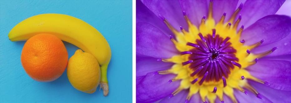
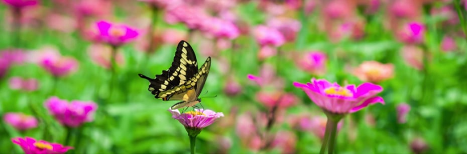
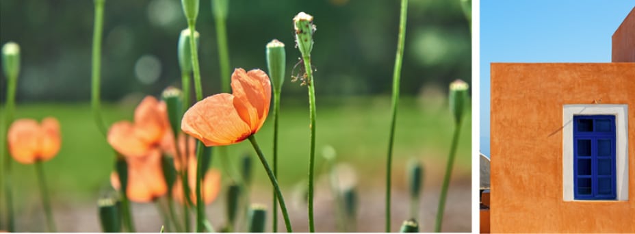
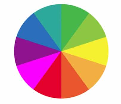
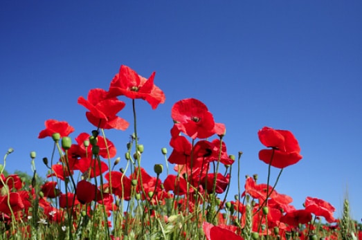
Contrasting colors are hard to ignore as they help create incredibly dynamic compositions. Think in terms of opposites on the color wheel. The most eye catching images are those that contain colors at opposing sides. For example orange / reds and blue / greens.
One Last Example of Color Concepts
Blue and orange, purple and yellow, pink and green. Photograph contrasting colors and you’ll no doubt capture your viewers attention.